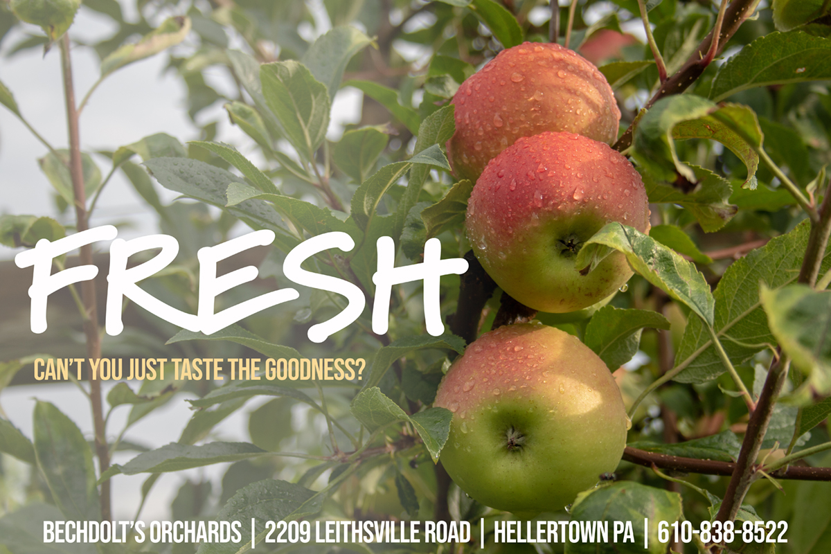
BECHDOLT ORCHARDS ADVERTISING
RMCAD, Bechdolt Orchards
2018
Photoshop
This project was to provide postcard advertising to Bechdolt Orchards that matched a web redesign concept and which might provide a concept around which Bechdolt could begin to develop a brand identity. As a small, locally-owned orchard, the client has no in-house design team nor does he have any sort of design budget. Providing branding in stages allows the client to shift from stock signage and packaging to a more coherent brand experience and allows for the development of a consistent voice across all marketing products. The photos were taken specifically for the client and Photoshop was used to provide the text overlays.


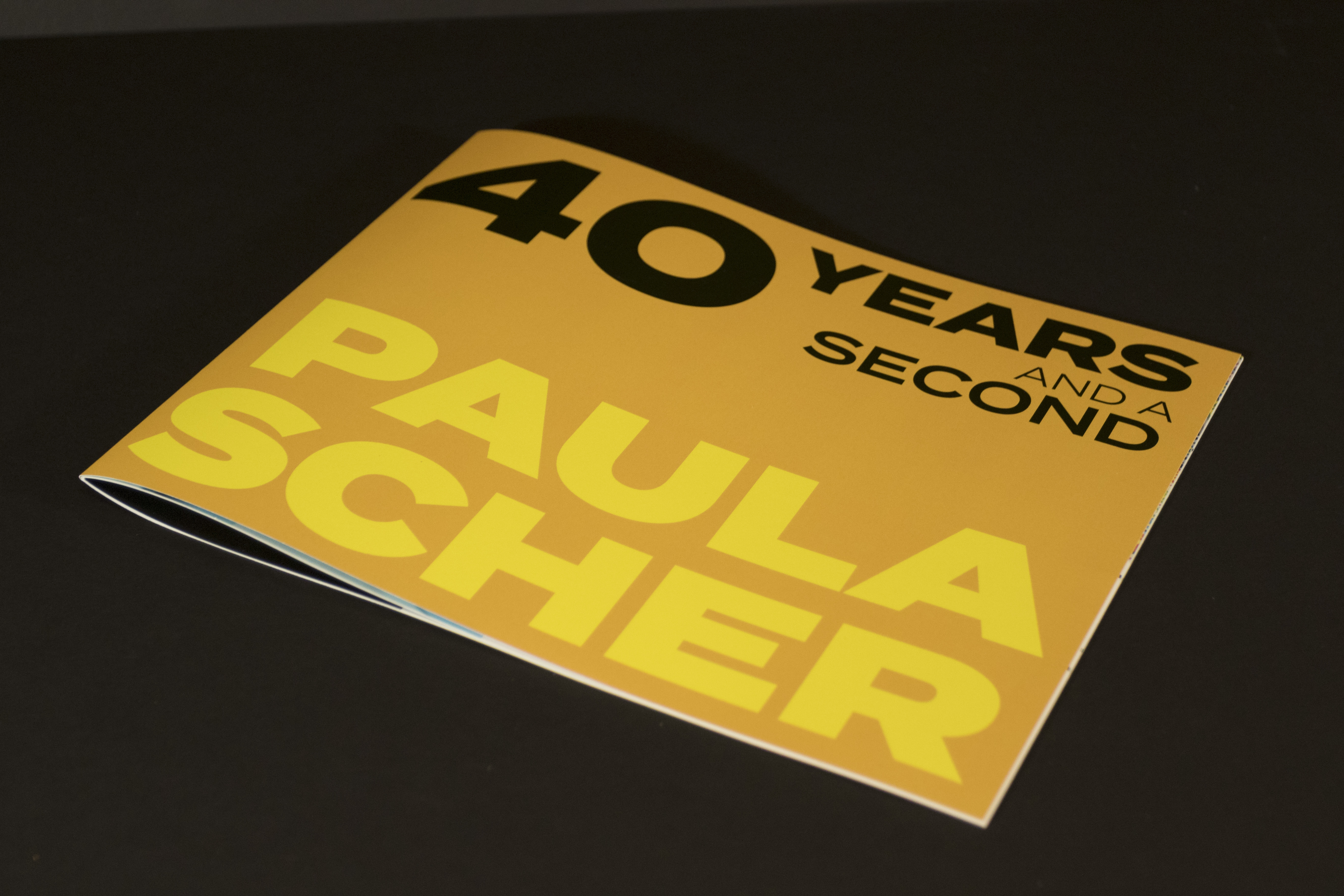
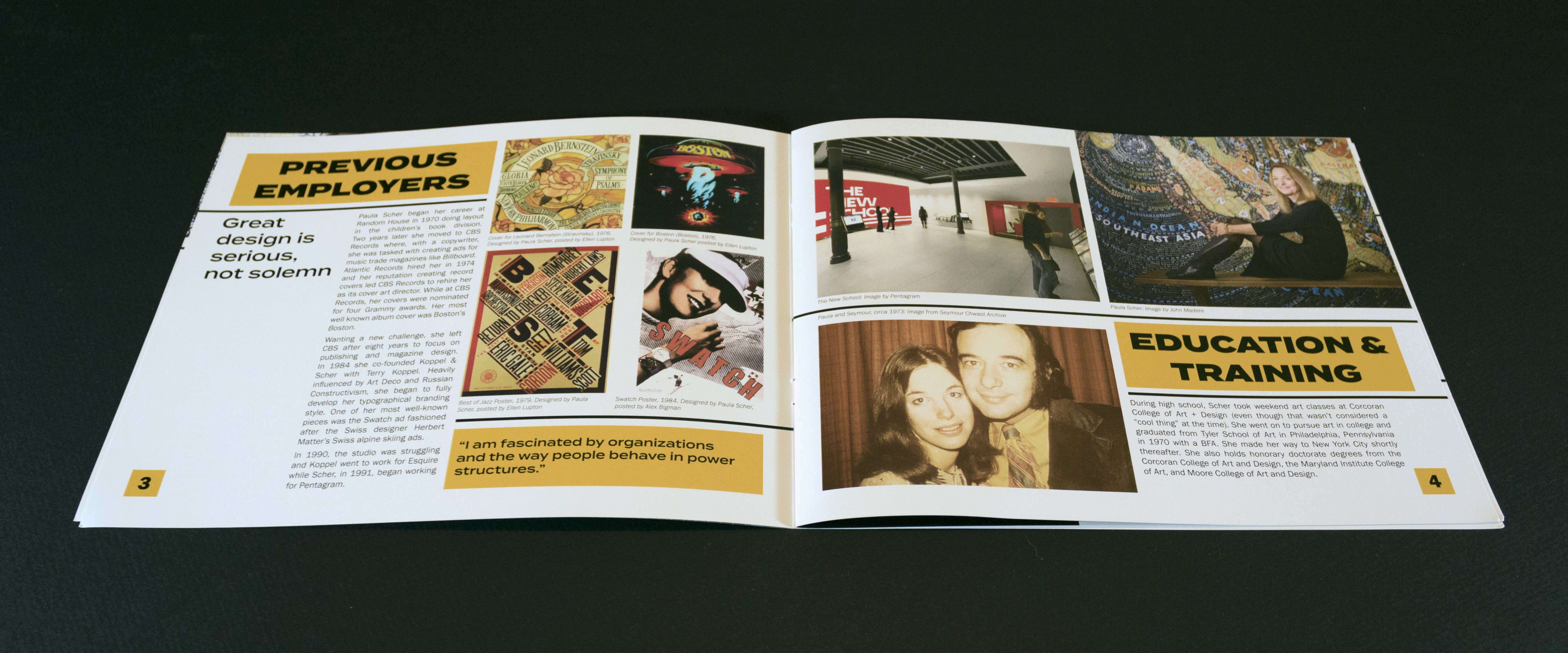
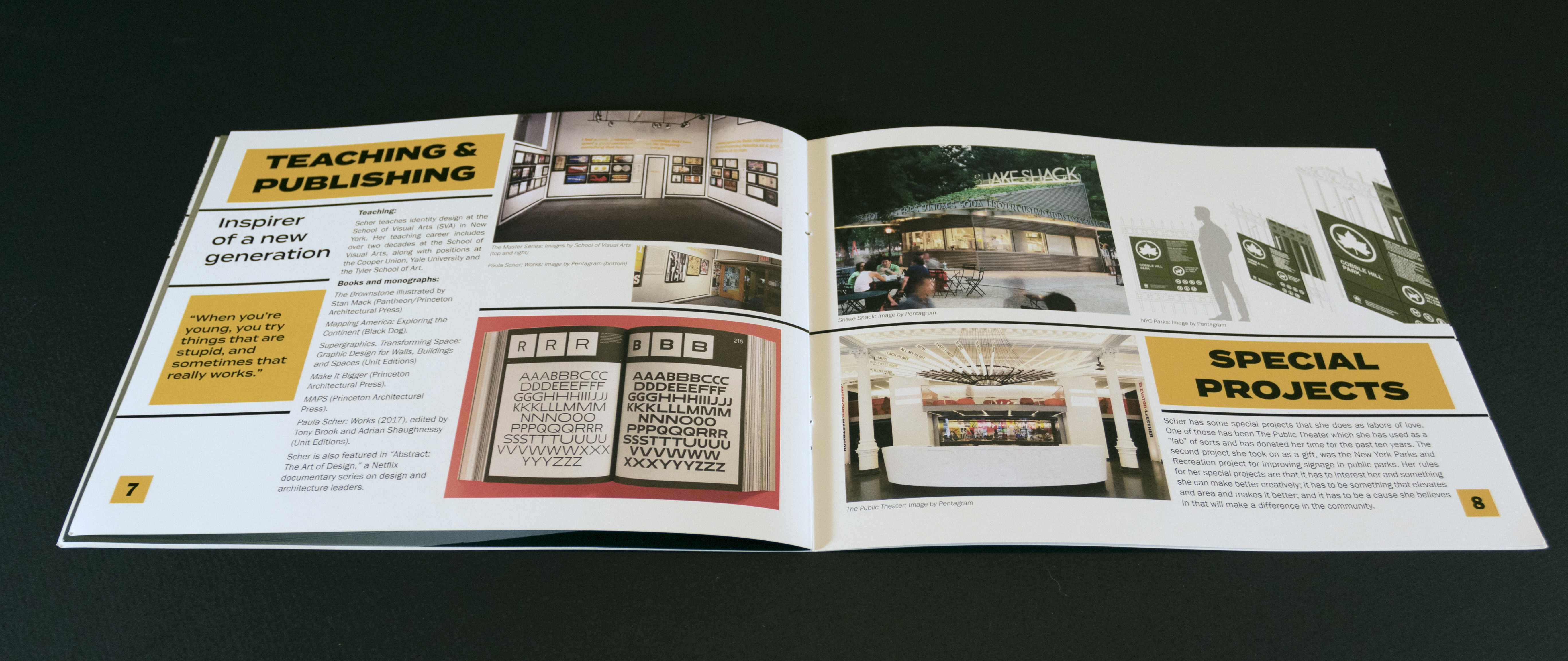
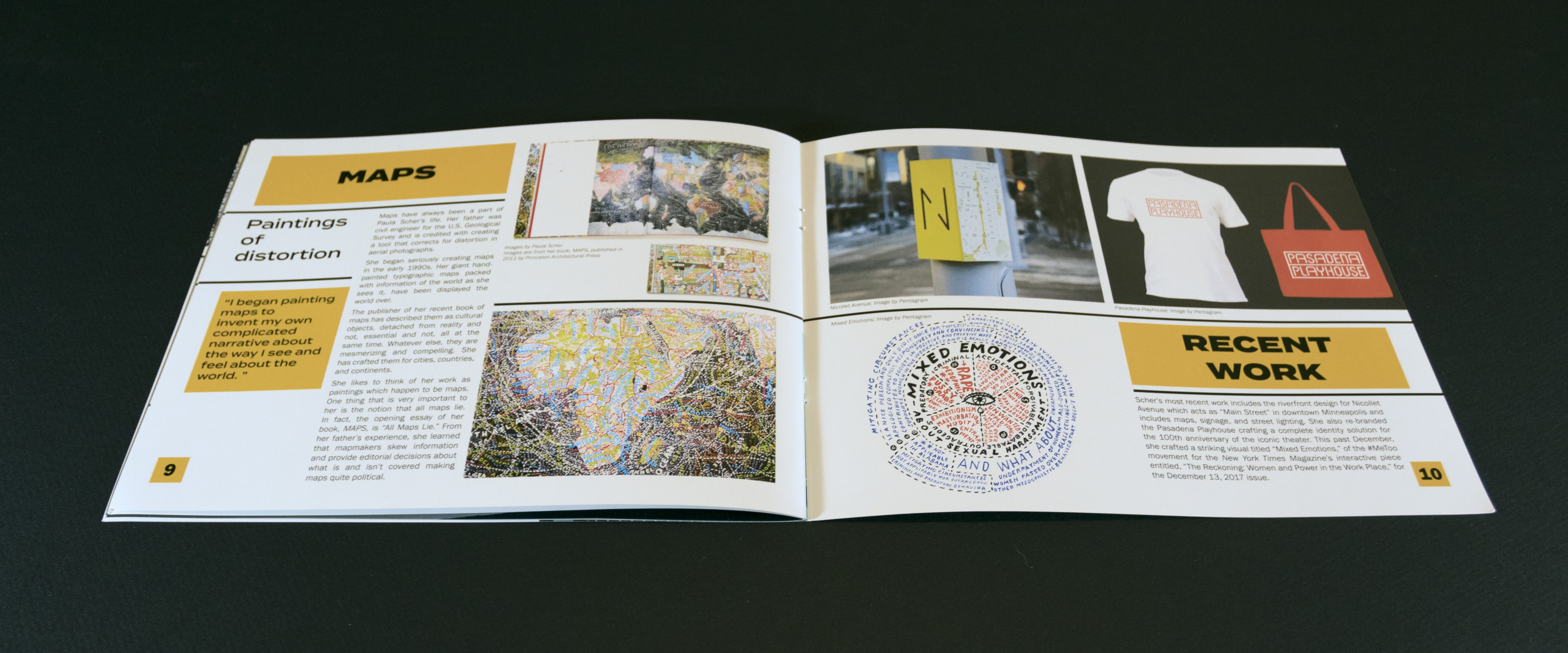
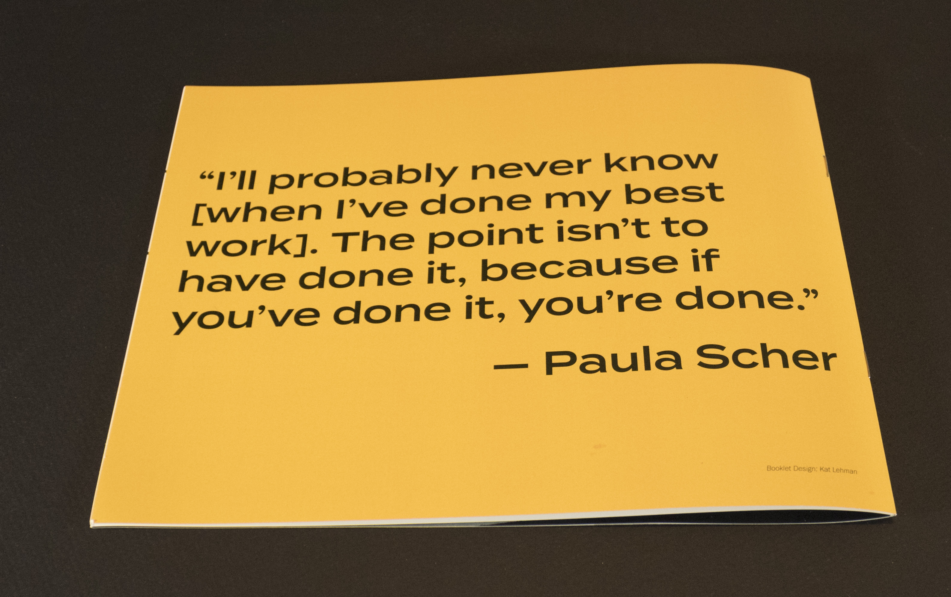
TWELVE-PAGE BOOKLET
RMCAD
2018
Photoshop, InDesign
This project highlighted the career of Paula Scher and was oriented with so the page spreads were 8½ by 22 inches. The unconventional size was the first time the printer had tried this particular setup in a saddle stitch mode. The colors and typography are similar to many of Scher’s bold work and the Swiss-style gridded layout is also indicative of her work. As she is known for her bold colors, the orange and yellow work to reflect her style. These are sample pages from that project.


TWO-PAGE MAGAZINE SPREAD
RMCAD
2018
Photoshop, InDesign
This two-page magazine spread highlights the plight of Thoroughbred racehorses who are often discarded once their racing careers have ended. It was intended to bring attention to a local horse trainer who is developing a training series specifically for Thoroughbreds who are being retrained in English pleasure, show jumping, hunt seat equitation, and dressage. The typography was selected in keeping with more traditional style of English riding. The color scheme is derived from the photo and is meant to flow from one panel to the next.

DEEP CREEK BROCHURE
RMCAD, Deep Creek Center
2018
Photoshop, Illustrator
The Deep Creek Center brochure was done to complement a new website the company was launching and the brochure was limited to two-colors. The company utilizes a deep blue for its logo which is a compass rose. The brochure is a gate-fold brochure so that when closed, the logo comes together. As a service company, Deep Creek wanted something that emphasized teaching along with their consulting practice.


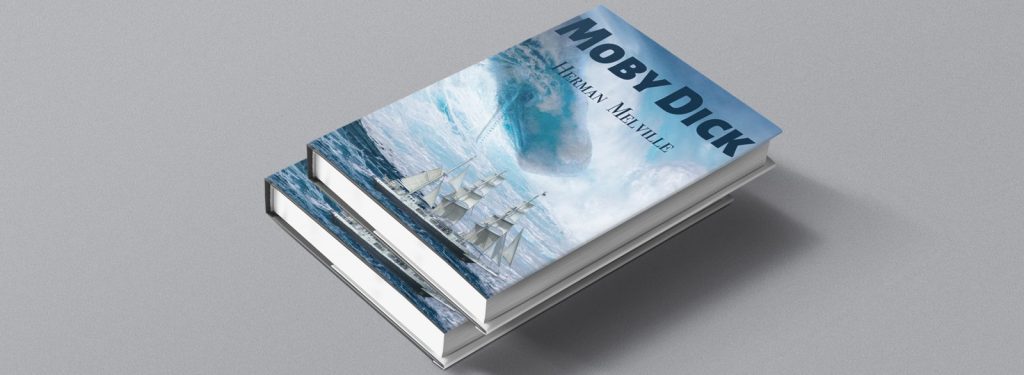
CLASSIC BOOK COVER
RMCAD
2017
Photoshop
This project was to composite a book cover for a classic book, re-imagining it for a newer generation of readers. I chose Dick for this project as it is one of the most iconic stories of hubris and revenge ever written. Since the story was based on the true account of the whaling ship Essex, I thought it appropriate to use a sailing whaler as the ship imagery trying to outrun a rogue wave and an angry whale. The compositing was done in Photoshop with stock photos and illustrations.
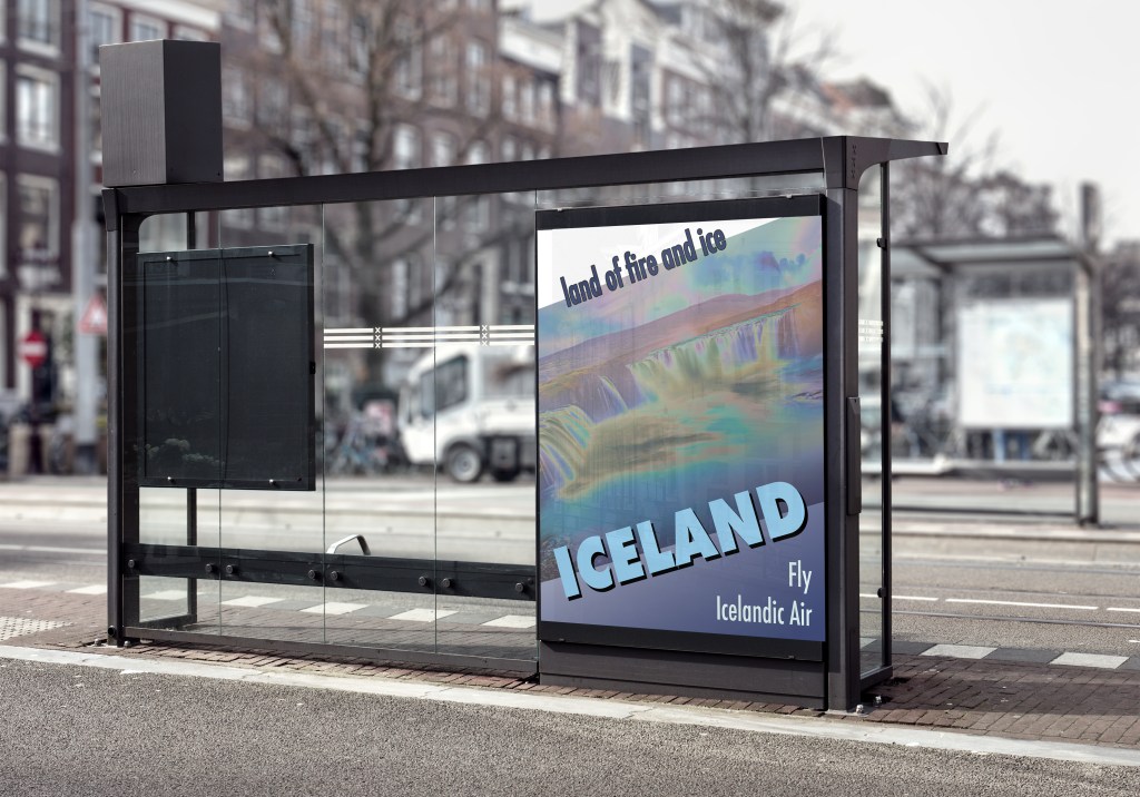
TRAVEL POSTER
RMCAD
2017
Photoshop
The Icelandic Air travel poster was inspired by the designs for Swiss Tourism done by Herbert Matter in 1935. Since it was meant to be a retro-modernist travel poster from that era, the fonts are reflective of that time using Futura and Gill Sans. Photoshop was used with a modified stock photo of Iceland as the backdrop.